Data Science
While completing my Ph.D. in Psychological Sciences at the University of North Carolina Wilmington, I became interested in data science topics and techniques. Under the mentorship of Dr. Dale Cohen, I developed technical discipline and a principled approach to statistical programming in R.
Since then, data science has become central to my professional practice. I specialize in building compelling data visualizations, producing polished static and dynamic documents, designing automated data workflows, and working with larger-than-memory data sets. I also actively integrate AI tools into my work — not as a shortcut, but to raise the ceiling on what’s achievable in analysis, visualization, and documentation.
Visualizations
The creation of visualizations is perhaps my favorite area of data science. A great visualization should be accessible to professional audiences regardless of their statistical background, while remaining aesthetically polished. For organizations, standardizing visual elements such as fonts, color palettes, and output dimensions helps ensure reports and presentations feel cohesive and consistent. My approach draws on both psychological principles (e.g., perception, color accessibility, and bias reduction) and data science tools that streamline production. My two primary tools are R (particularly ggplot2) and Adobe Illustrator.
Standardized Visuals
Researchers and organizations routinely rely on common visualization types like bar, histogram, line, box, and scatter plots to communicate findings. Producing these efficiently and consistently is critical to a healthy workflow, particularly when reports and presentations need to share a unified visual identity.
To address this at the Center for Collegiate Mental Health at Penn State University (CCMH), I developed a suite of R functions built on ggplot2 that generate standardized, CCMH-specific plots. These functions are available in the CCMHr GitHub repository. Each function exposes over 40 customizable arguments that control dimensions, titles, legends, text, and more, while defaulting to CCMH-standard settings. This means a researcher can produce a properly formatted plot with minimal code, while still having the flexibility to override any default when a specific use case demands it.
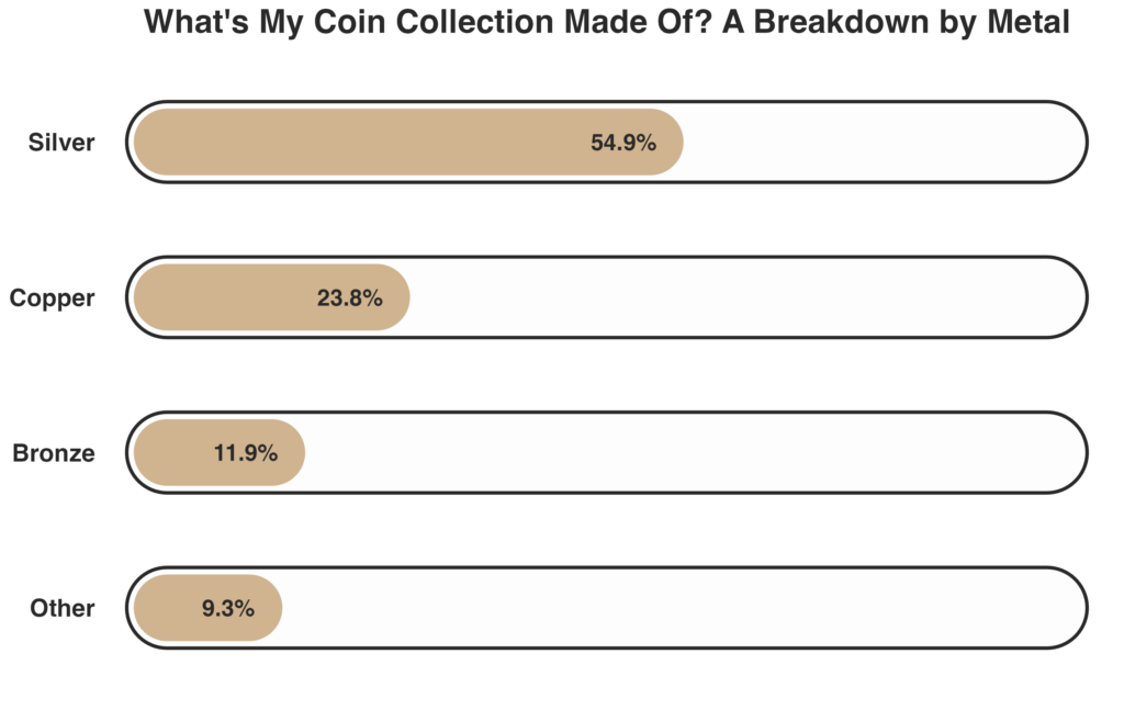
To illustrate, I’ll walk through a few examples using a dataset from my personal coin collection that examines the number of coins I own from select countries in South America and Asia (Cuba, Mexico, China, and Japan). You can read more about my coin collection on the Personal Information page.
First, here is a standard ggplot2 column plot:
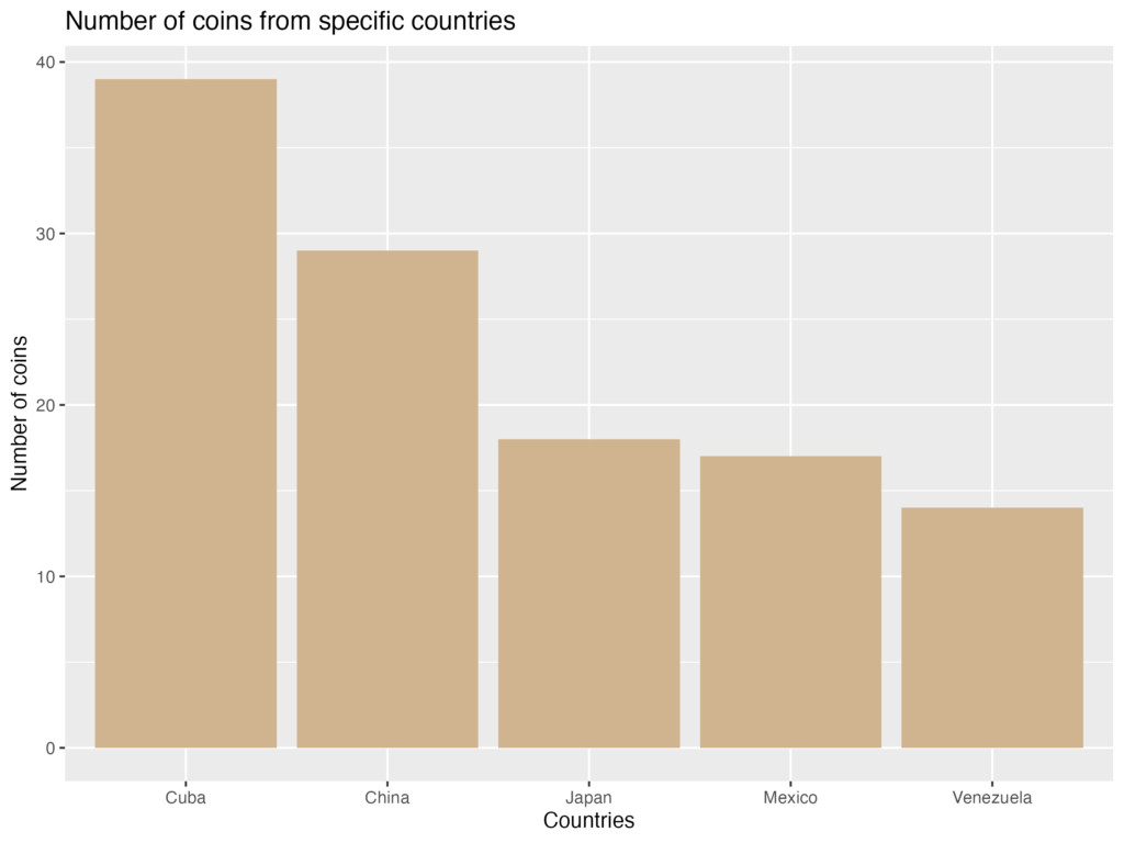
The visualization is readable, but the plot is visually busy with grid lines and panel background, and certain elements, like the y-axis label, are difficult to read. Now, here is the same plot produced using my CCMHr plotting function, with most arguments left at their defaults:
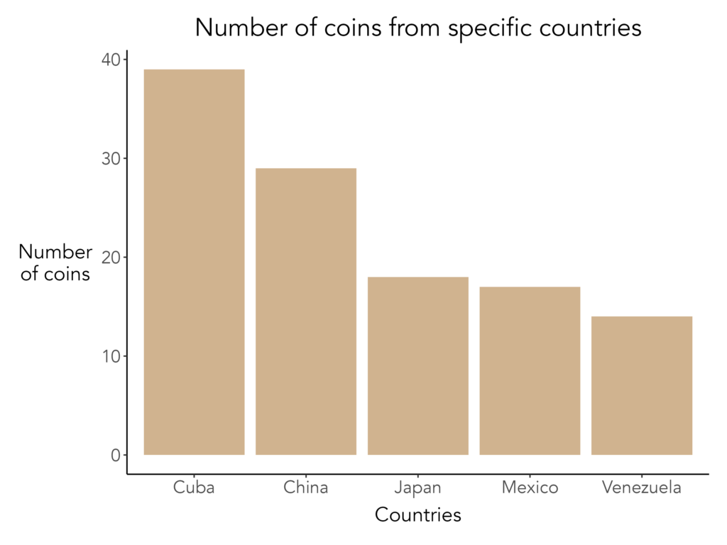
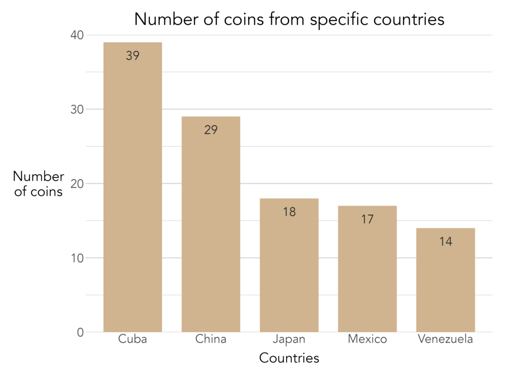
With only a few lines of code, the plot is cleaner, more polished, and formatted consistently with other CCMH outputs. Adding further detail is equally straightforward. For instance, here are some other aesthetics I would add to improve the visualization:
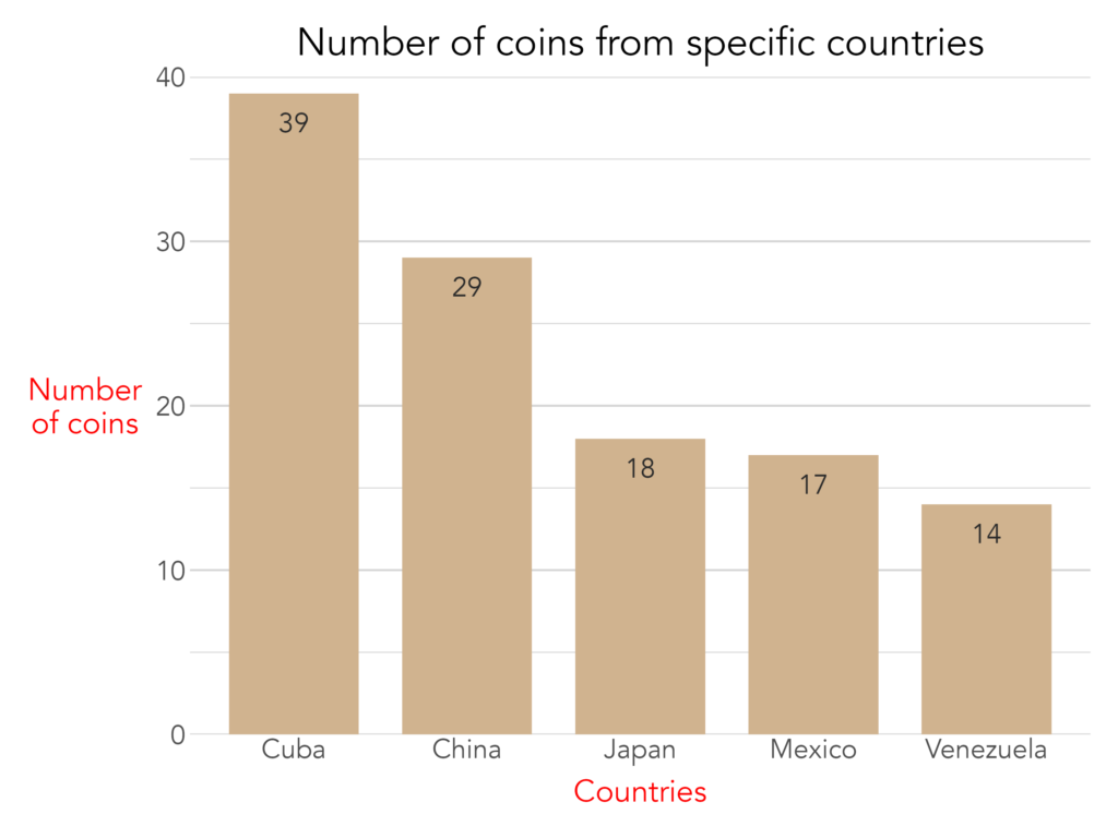
Of course, no set of predefined arguments can anticipate every need. When a customization falls outside what the function natively supports, the plot.elements arguments allow researchers to pass raw ggplot2 code directly, granting access to ggplot2's full range of functionality without sacrificing the standardized baseline. The example below uses plot.elements to modify the axis title text color for a special report:
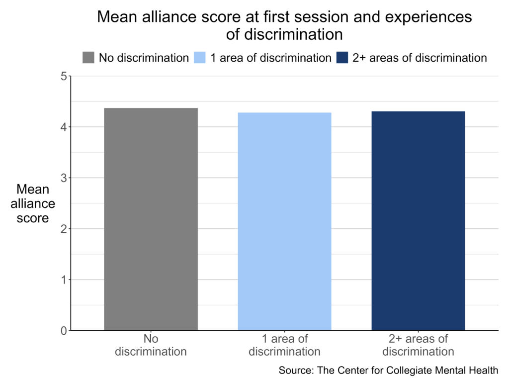
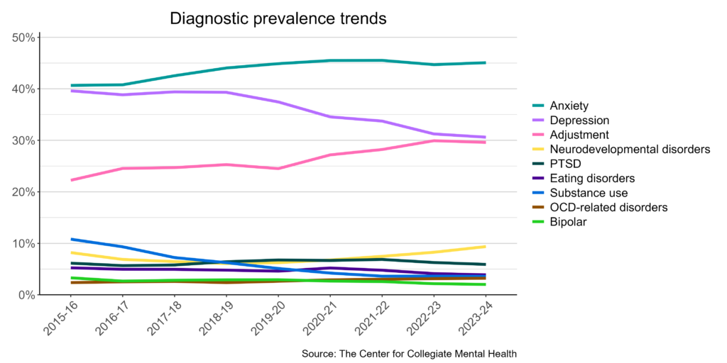
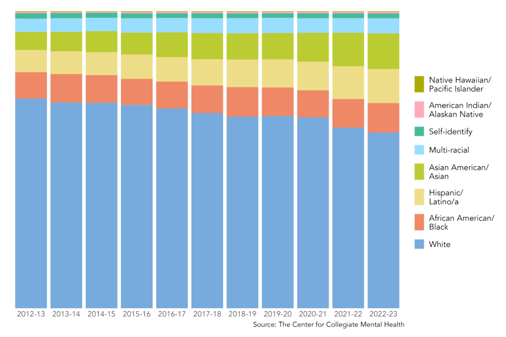
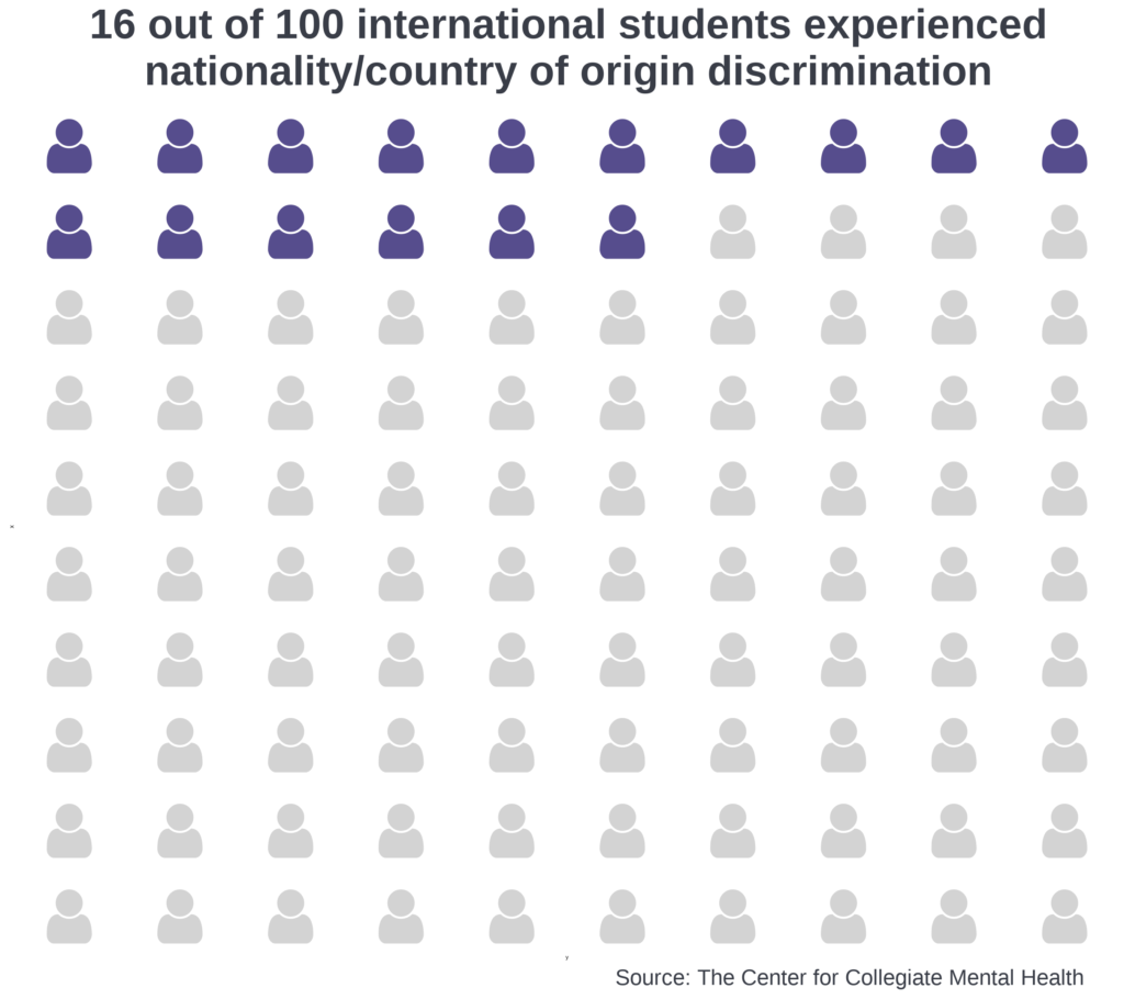
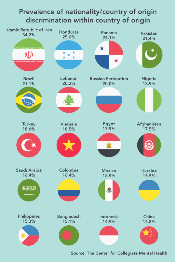
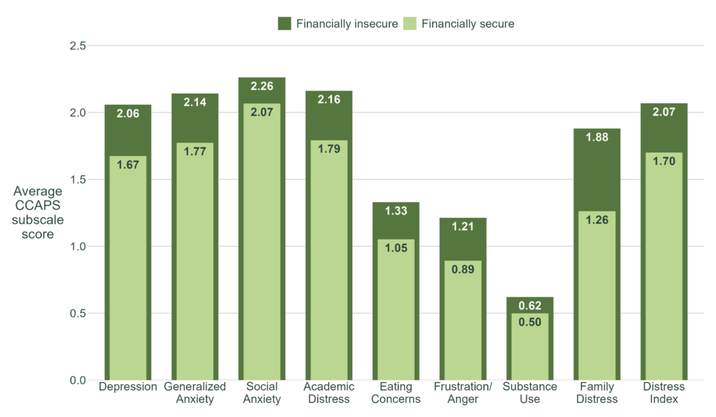
Below are examples of published visuals produced using CCMHr plotting functions:
Custom Visuals
Standardized functions are built for efficiency and consistency, but some projects call for something more tailored, or a design that aligns with a specific report's aesthetic. In these cases, I build fully custom visuals from the ground up using ggplot2 and Adobe Illustrator.
Here is an example of a custom plot built entirely in ggplot2:
Below are examples of published custom visuals:
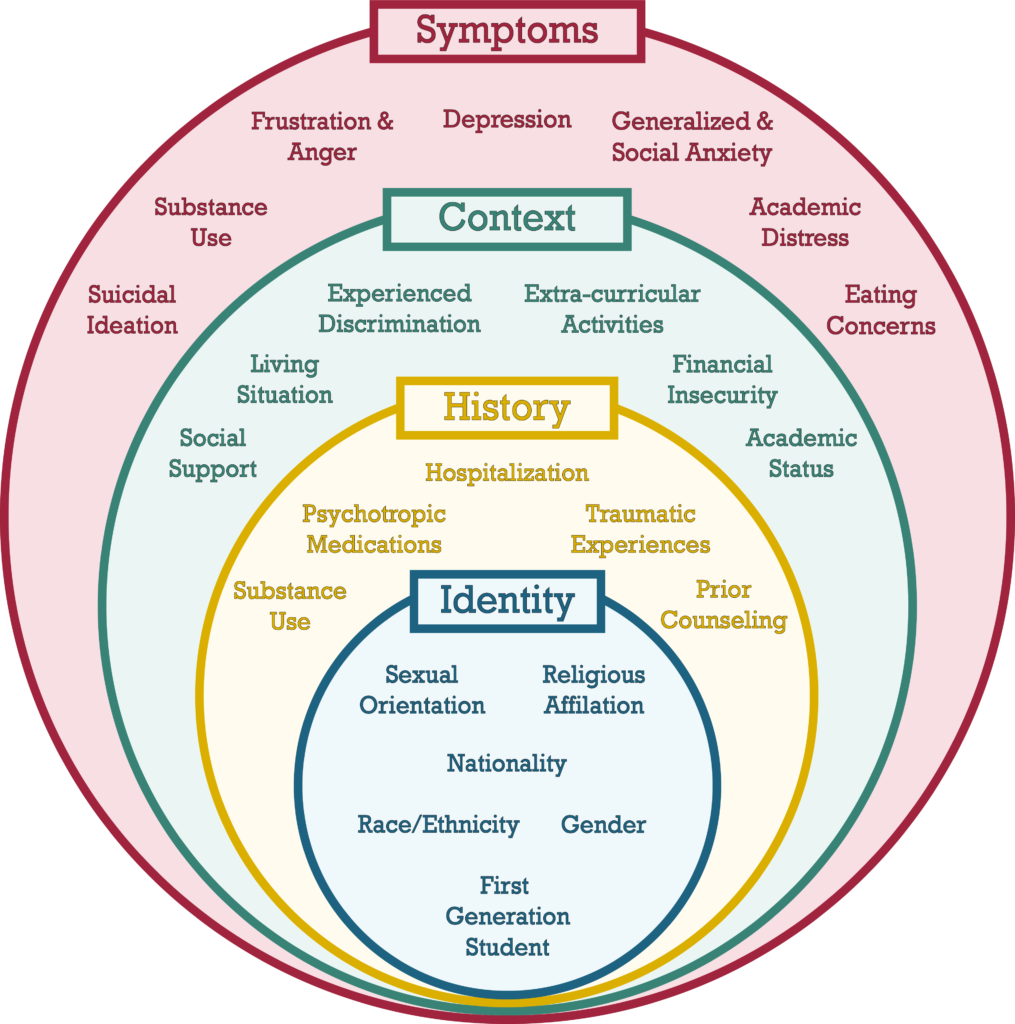
Process Visuals
Not all visuals communicate results! Some communicate contextual details about a project. Process visuals describe the structure behind the data: how it was collected, how variables are defined, or how a cleaning or analytical pipeline works. Done well, these visuals help audiences understand and trust the analysis before they ever see a finding. I typically create process visuals in Adobe Illustrator, which gives me precise control over layout and design.
Below is an example of process visual:
Data Art Visuals
Data art sits at the intersection of analytics and design. Often, I use vector graphics (a form of computer graphics) to represent specific constructs like people, institutions, or abstract concepts. These vector graphics are often arranged to tell a narrative. The number, color, size, and arrangement of vector graphics are sometimes related to statistical aspects (e.g., the prevalence of something, a point in time).
Below is an example that visualizes the national dropout rate among college students from enrollment to graduation, using data from IPEDS. Vectors were obtained from Adobe Stock, and edits were made in Adobe Illustrator.

This visual shows students progressing toward the goal of graduating from college. The figure symbolizes this journey by depicting students walking along a light grey path that visibly narrows from left to right, representing attrition as students move through each milestone. Three rings mark key time points along the path: starting college, continuing enrollment after the first year (75.4%), and graduating within 6 years (61.0%). The first ring serves as the 100% baseline and carries no percentage label. The size of each subsequent ring corresponds to the percentage of students who reach that time point. The rings progress from light to medium to dark blue, mirroring a broader color progression across the entire visual.
The number of student figures visible between each pair of rings also corresponds to the percentage of students who will reach the next time point, with 10 figures representing 100%. From the start through graduation, students carry a backpack whose shade deepens from light to dark blue as they progress. After passing through the final ring, the student figure is shown wearing a dark blue graduation cap, signifying the transition from an enrolled student to a graduate.
Documentation
Documentation is critical to disseminating research findings, building project manuals, and communicating the scope and structure of analytical work. My primary tools for documentation are Quarto and Adobe Illustrator. Quarto is an open-source scientific and technical publishing system that supports R, Python, and other languages, which makes it well-suited for dynamic, reproducible reports. Adobe Illustrator is better suited for work that demands a more polished visual presentation, such as executive summaries and infographics.
Static Documents
Static documents present fixed information that, once produced, remains unchanged unless the document is manually updated. They are well-suited for special project reports, technical manuals, and any deliverable where the underlying data and conclusions are final.
At CCMH, I developed a technical manual for the CCMHr package that documents its functions and arguments, and I update it manually as the package evolves. I have also produced static reports detailing project scope, data collection methods, analyses, and conclusions. Many of these documents are internal, though CCMH is introducing a series of quarterly data briefs focused on topics in collegiate mental health.
Dynamic Documents
Dynamic documents update automatically when new data is introduced or the document is re-rendered, making them essential for reports that need to be refreshed on a regular cadence. At CCMH, the data science team has developed several dynamic reporting workflows. My contributions to these vary across projects.
One strong use case is the Annual Report, where the structure and narrative remain largely consistent year over year, but statistical summaries update automatically as new data is incorporated. Only general conclusions and any new variables require manual revision. The CCMH Annual Reports are available here.
Dynamic documents are also well-suited for producing reports at scale. CCMH partners with over 800 university and college counseling centers, most of which receive a comprehensive report tailored to their center each year. Generating these manually would be time-consuming and error-prone, so we use dynamic reporting procedures to automate their production. Because centers vary on what data they collect, the reports incorporate conditional logic to determine what content is displayed and how it is visualized. An example of a comprehensive report is available here.
Scrollytelling
Scrollytelling is a digital storytelling technique that uses interactive and animated elements to guide readers through a narrative as they scroll down a page. Unlike a traditional webpage or blog post, the experience is paced and structured — closer to a guided presentation than a passive read.
At CCMH, I developed a scrollytelling piece that explains the Clinical Load Index (CLI), a complex data construct that helps university and college counseling centers assess whether their service capacity aligns with the expectations of students, administrators, and other stakeholders. The project combined R, Adobe Illustrator, Adobe Stock, Quarto, and Close-Read, with careful attention to how information was sequenced and revealed throughout the scroll experience.
Executive Summaries and Infographics
Executive summaries and infographics distill complex findings into concise, visually compelling formats, making them effective tools for communicating with administrators, stakeholders, and other audiences who need the key takeaways without the full technical detail. I use Adobe Illustrator, Adobe Stock, and R to produce these materials, combining data visualizations with a clear narrative structure. All executive summaries and infographics I have created at CCMH are for internal use.
Other Critical Topics
Data Automation
Data automation encompasses techniques that streamline and optimize data-related processes, including collection, cleaning, analysis, and dissemination. This reduces the need for manual intervention and frees researchers to focus on other important tasks. It is one of the most critical capabilities for managing data effectively and producing findings efficiently across a research organization.
At CCMH, I dedicate significant time to building and maintaining automated workflows. The comprehensive reports described in the Documentation section are nearly fully automated. Data is imported from servers annually, then passes through a pipeline that cleans and processes it, generates figures, compiles reports, and emails them to individual centers. The up-front investment in building these workflows is substantial, but once in place, they require only minor maintenance and occasional updates.
CCMH also automates specific data cleaning and processing procedures to support data integrity and enable consistent analytics. Many functions in the CCMHr package serve this purpose. For example, identifying a client's primary therapist is a common problem, where a client may be seen by one or several therapists over the course of treatment. I developed a CCMHr function called identify_primary_therapist that handles this in a single call, with a configurable threshold argument that defines the minimum proportion of sessions required for a therapist to be designated as primary. Automating decisions like this ensures they are applied consistently across the entire dataset rather than handled on a case-by-case basis.
Larger-Than-Memory Data
Working with larger-than-memory datasets is common across many research organizations. At CCMH, we frequently encounter datasets that are too large to load directly into working memory, requiring more efficient approaches to data ingestion and analysis.
One solution has been to adopt Parquet files and read data as Arrow tables using the Arrow package. This allows us to select variables and filter rows before loading anything into memory, significantly reducing processing time and the likelihood of crashes.
We have also incorporated functions from the data.table package into CCMHr's data cleaning and processing functions. Compared to tidyverse and base R equivalents, data.table functions have meaningfully improved processing speed and stability, particularly when working with large clinical datasets.
Use of Artificial Intelligence (AI)
AI has become one of the most transformative tools in my data science practice. I use it across a range of tasks such as improving technical documentation, conducting qualitative coding, detecting errors in functions, and generating ideas for data presentation. More importantly, AI has meaningfully expanded my use of programming languages where I have less experience, including Python, HTML, Sass, YAML, and CSS/SCSS, broadening the range of data products I can build.
While AI cannot replace the foundational etiquette and skills developed through my Ph.D. training and early work at CCMH, it has substantially raised the ceiling on what I can produce independently.
Skills and Languages I Want to Learn
I am always looking to expand my skill set. On the analytical side, I am interested in deepening my work with LLM-based qualitative coding, building and deploying machine learning models, and conducting time-series analyses. I am also interested in strengthening my Python and SQL programming skills to broaden the range of tools available to me.